INDUSTRY:
F&B
CLIENT:
The Local Beet
YEAR:
2024
CATEGORY:
Branding
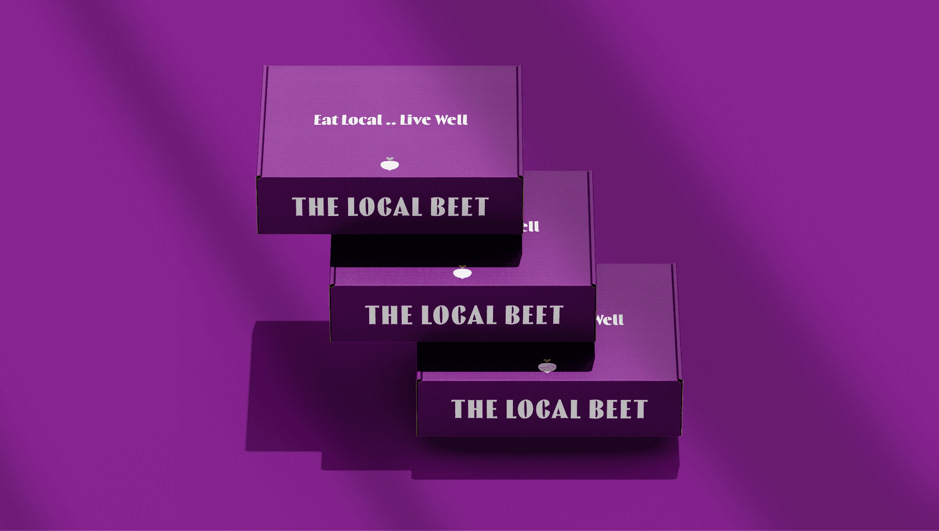
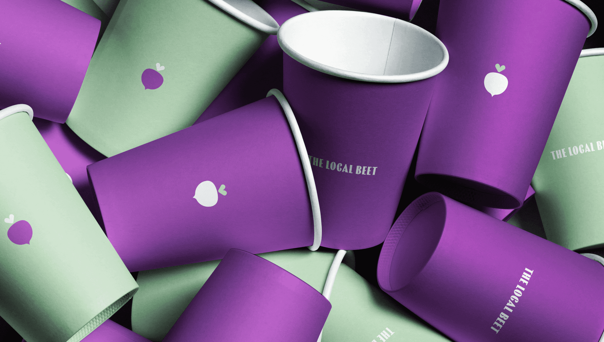
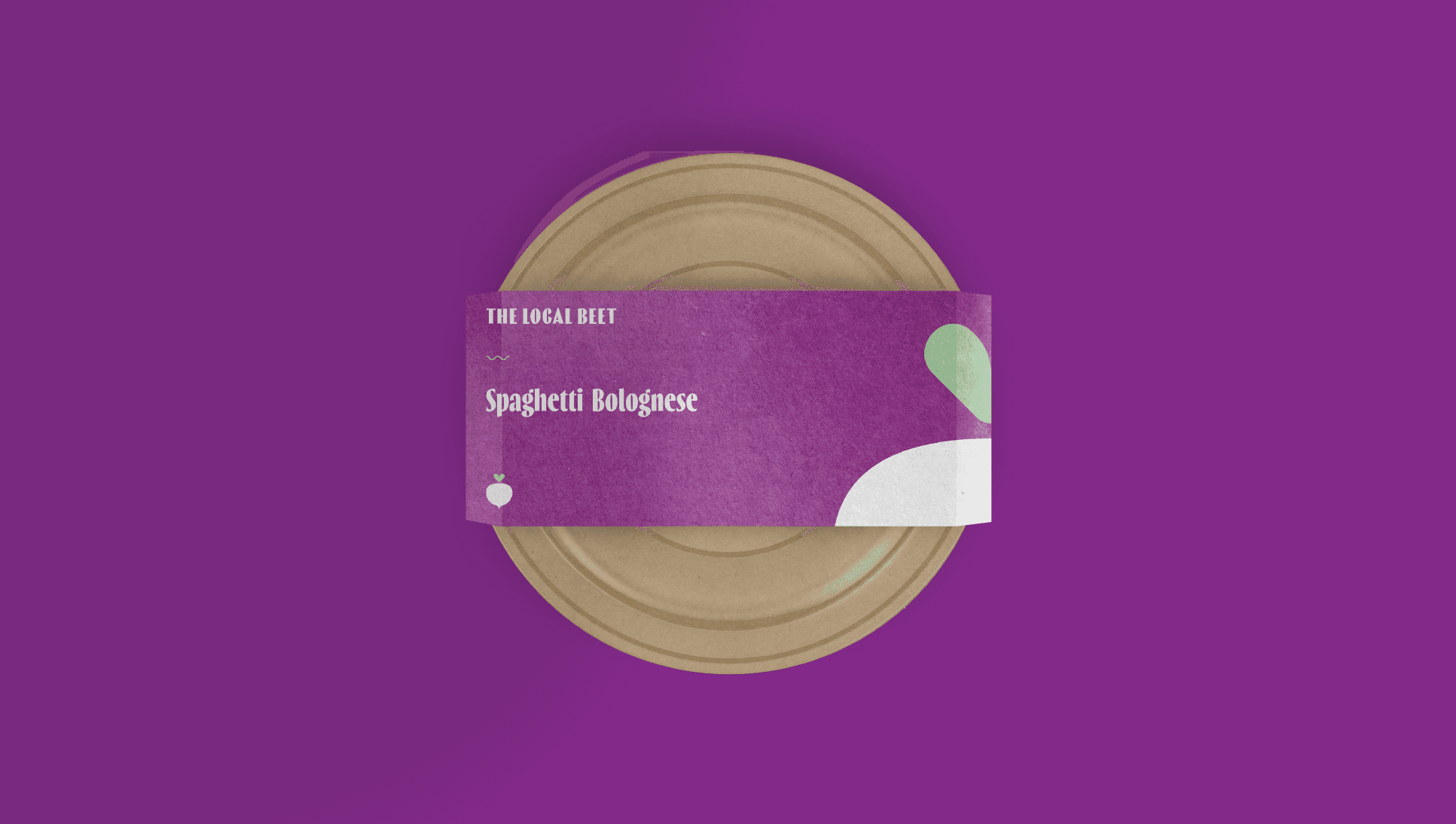
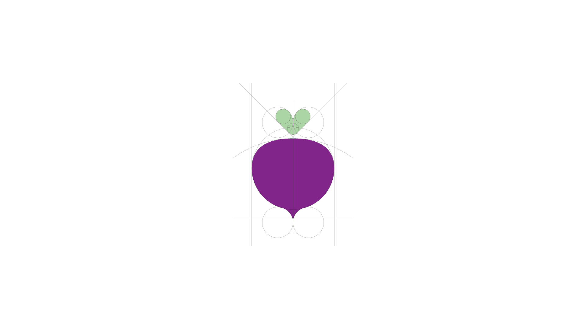
The Local Beet
A streamlined visual identity built around a simplified beet icon, bold colors, and consistent packaging applications. The refreshed system creates clarity, flexibility, and strong brand recognition across every touchpoint.
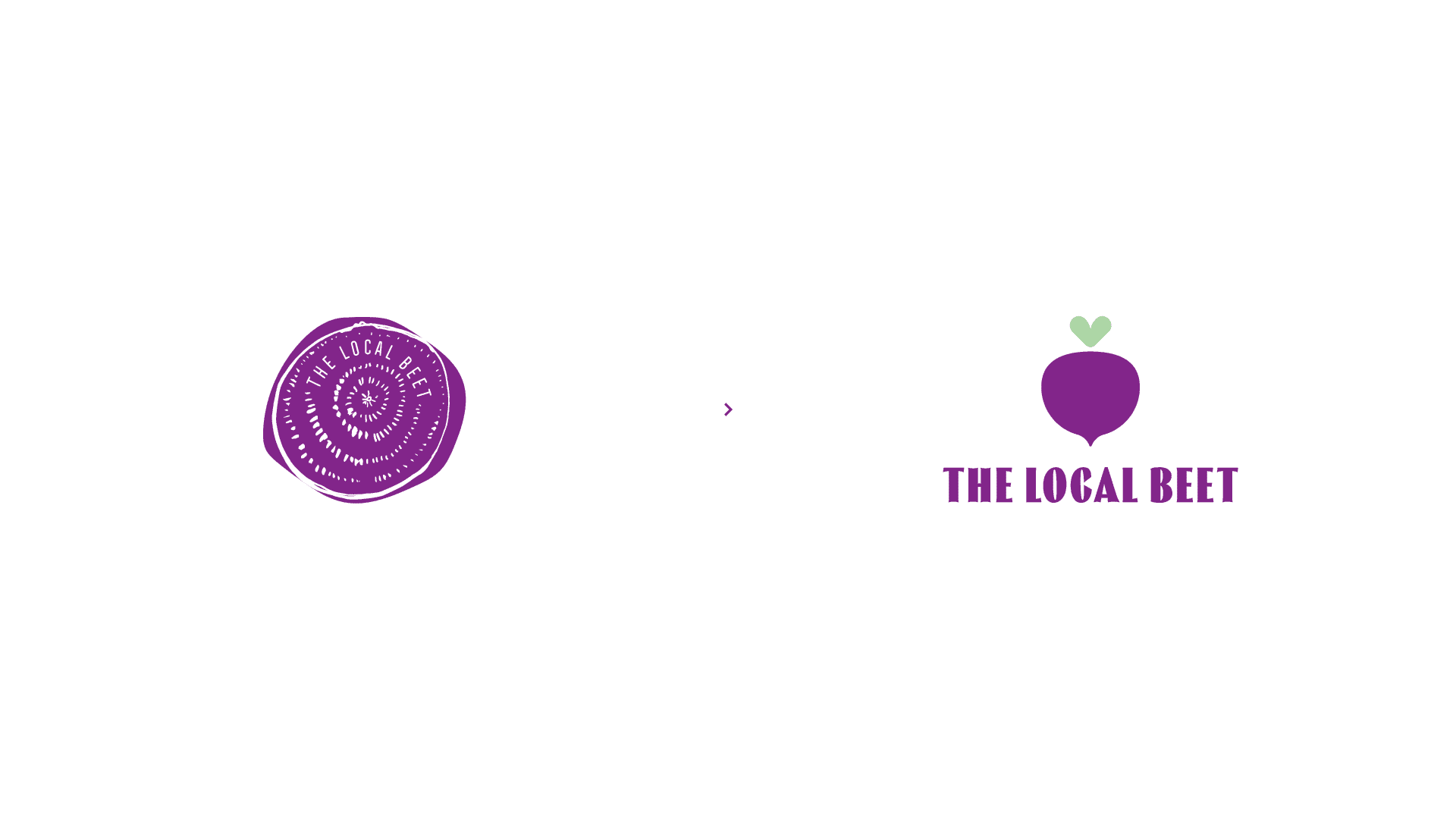
The design direction embraces a vibrant yet minimal aesthetic, allowing the brand to feel fresh, modern, and approachable. Every element, from the logomark to the packaging layouts, was crafted to communicate wellness through simplicity.
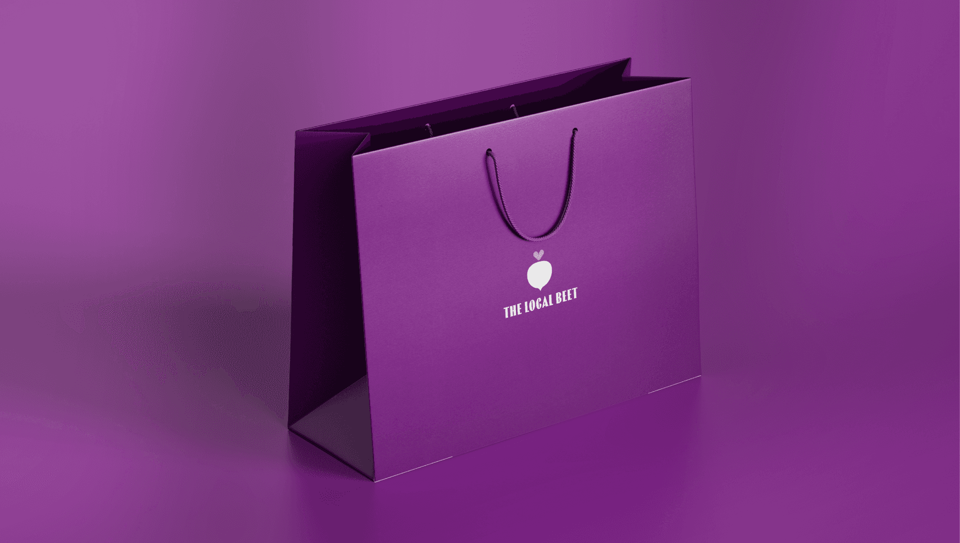
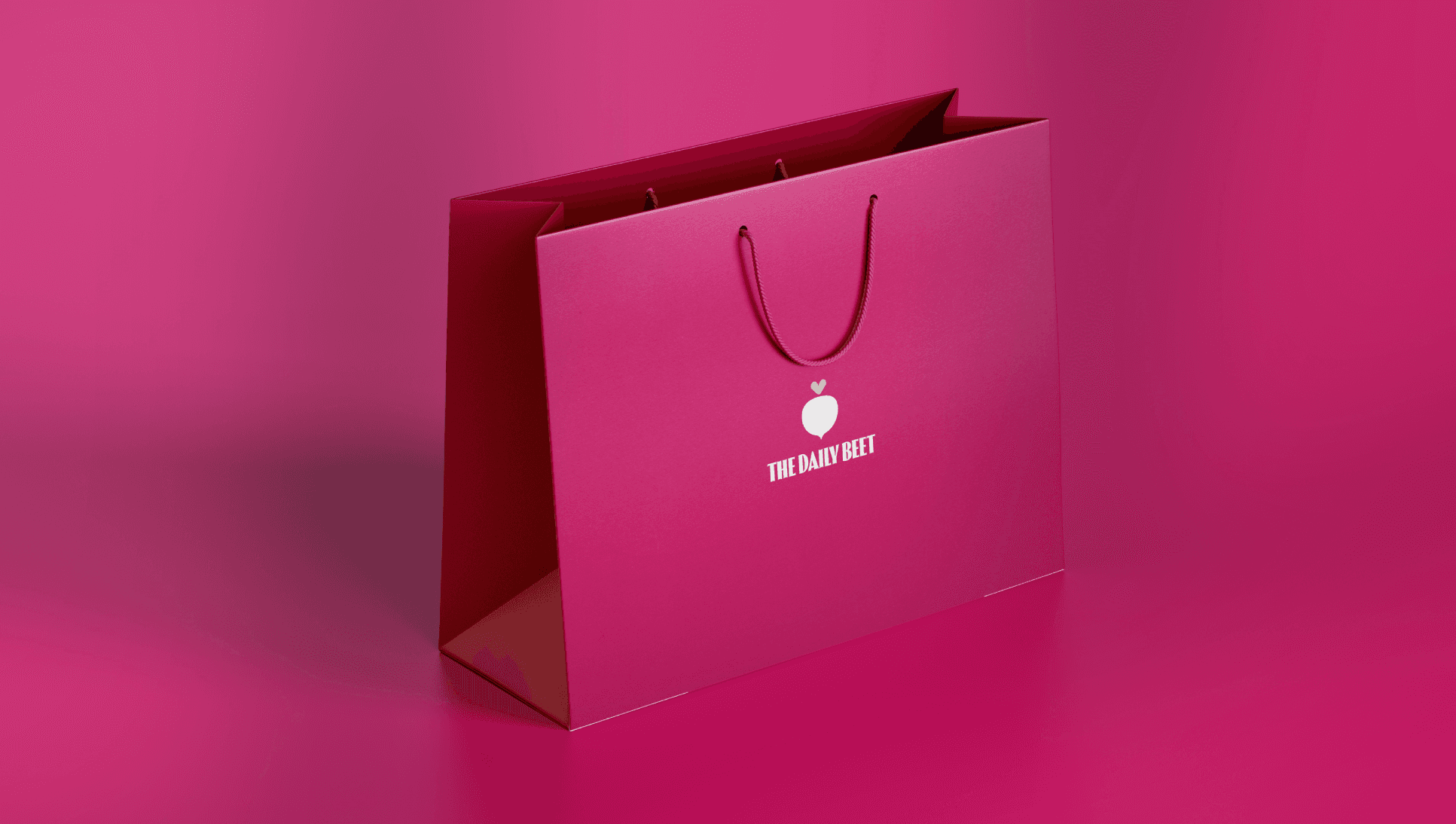
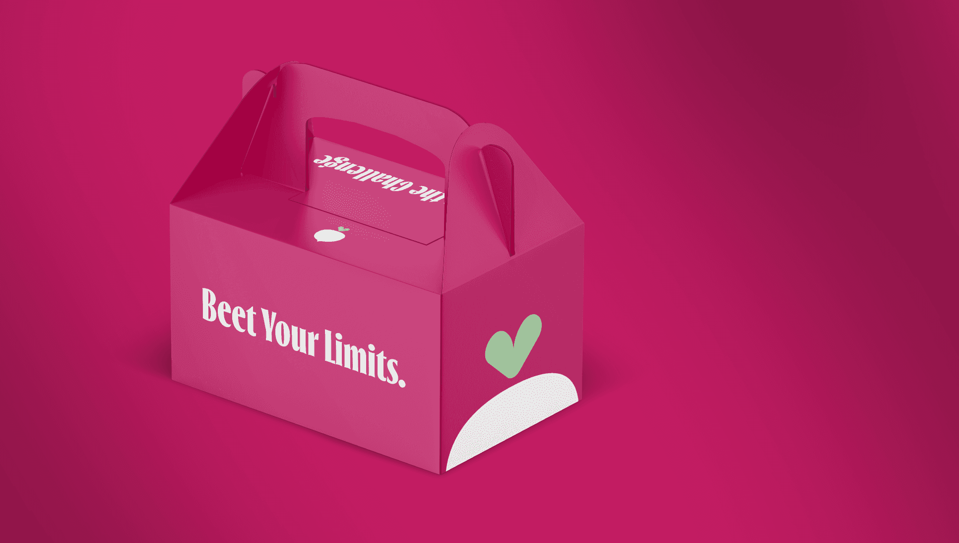
This system also introduces a scalable foundation that seamlessly extends into the sister brand, The Daily Beet, allowing both identities to coexist with a unified visual language while maintaining their own personality. Whether on delivery boxes, retail bags, or on-the-go containers, the brand adapts fluidly across applications and future product lines.